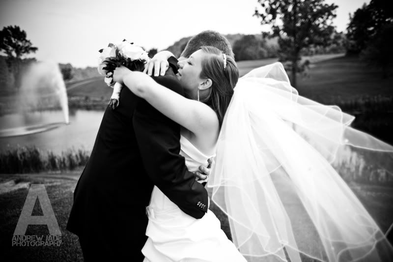
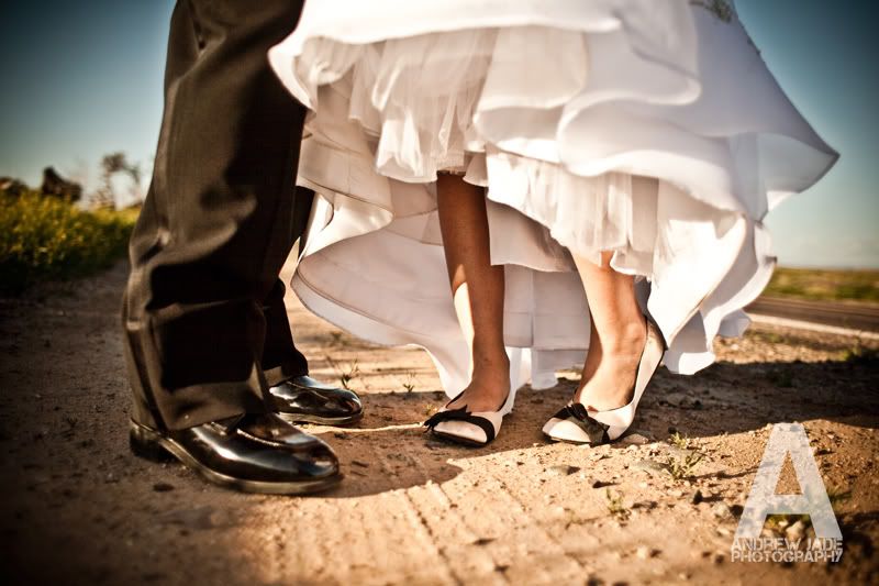
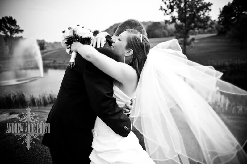
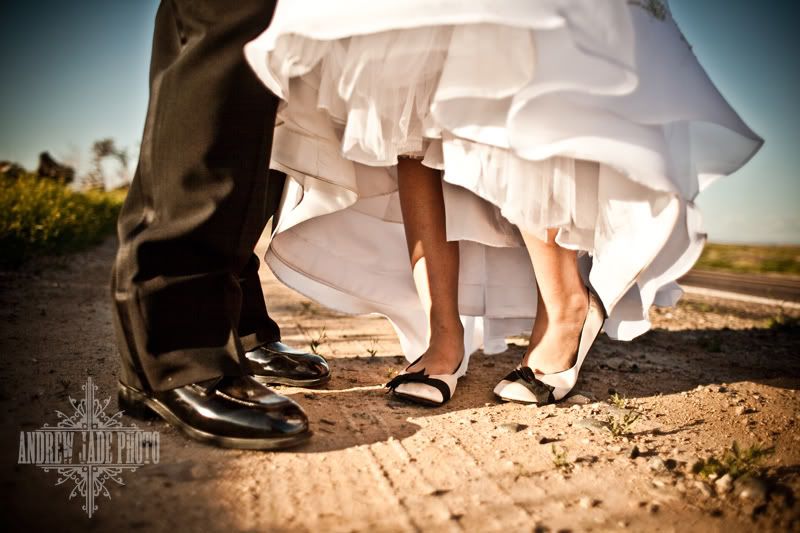
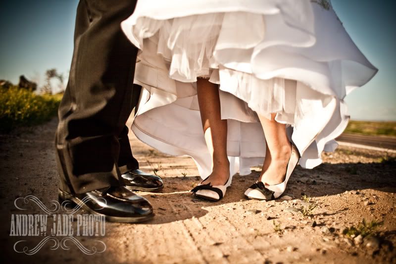
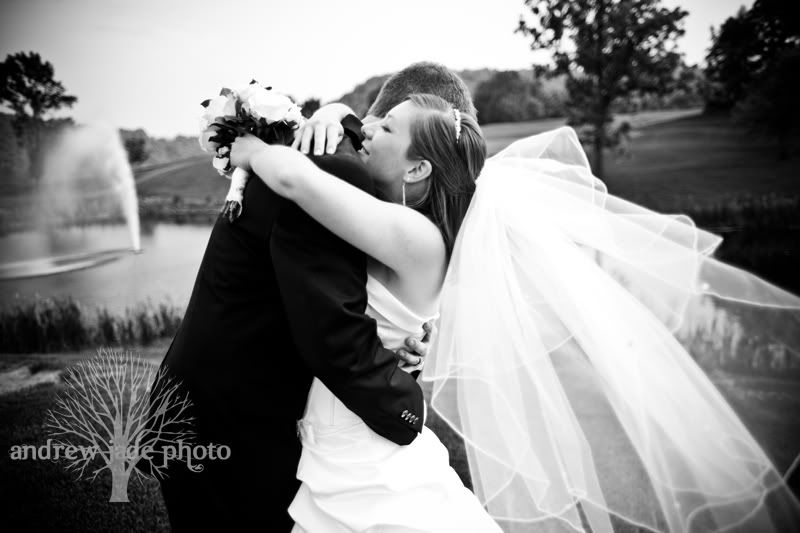
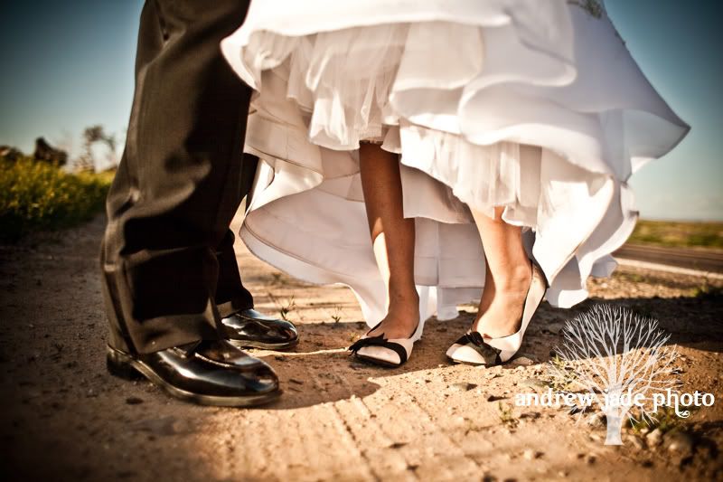
Here's what we want in a logo. The most important attribute is that it be recognizable. We need brandability here, people (I think I just made that word up but it fits so I'm going with it). :) We also need something that will look good on romantic and cinematic photos as well as the more artistic and edgy shots. So I am providing two samples for each logo to give you an idea of what they would look like for each kind of picture. We would love to see a HUGE response from you guys and any of your friends that would like to chyme in with their 2 cents. For those of you who have not commented on our blog before, here's how you do it:
At the bottom there is a link to comment (YOU DONT NEED A BLOGGER ACCOUNT). Just add your comment. There is a 'comment as' drop down menu; you can put your name in there or even comment as anonymous if you don't want anyone to know who you are for fear that they may judge you for your favorite logo... We have seen this before :) JK
So here they are:
So there you go, guys! Let us know what you think and we will be letting you know what we decide by the end of next week (hopefully). Thanks again guys for your help!
Andrew



Not sure if it posted the first time... No question about it... I like Showtime2 :o) Great choices though!!
ReplyDeleteThe 'A' logo is by far my favorite!!!
ReplyDeleteDebra Mavis
Definetly the showtime2!!! :)
ReplyDeleteShowtime or showtime2. I like the unique shape of the showtime; at first glance it's recognizable, edgy yet classic, intricate yet simple. I think either one would be great, though. I didn't so much like the A one unless the A were to be sized down just a bit.
ReplyDeleteThe A logo is the best.
ReplyDeleteI really love the tree in the background!
ReplyDeleteBig A for me :) love you guys
ReplyDeleteshowtime logo1 is my fav. it doesn't overtake the photo, yet is noticeable as a design on the pic. it has a vintage flair to it too, which is the way you are going for bridal shows. K thanks!
ReplyDeleteThe mom
My fav is showtime 1 for sure. I agree with "the mom" on its vintage-ness. I think it's a recognizeable design, and I really like the bold font.
ReplyDeleteComing in second is Oak. I think its very unique. How many photographers have frilly swirly designs vs. trees? Not as keen on the font, but the tree alone could end up being a sort of trademark, if you wanted.
Hope that helped :) Good luck deciding, friends!
I love love love the oak tree!!!! maybe with a different font, but i love the imagery in a tree and meanings that it can have (the growth etc.).
ReplyDeleteProbably next would be the A surprisingly. I didn't care for it before but I like it now. And it reflects the company name well so it would be easily remembered.
Wow I love them all! But for the purpose of voting I'd have to say the Oak Tree is my favorite with Showtime 2 being the close second! :)
ReplyDeleteShowtime 1 :)
ReplyDeleteI like the showtime 1 and I agree with the vintage thing too!
ReplyDeleteFrom what I have seen of your photography; I think the Oak Tree is the best fit. It looks great and incorporates natural beauty which you two are great at utilizing!
ReplyDeleteI love the showtime 2 and the oak tree!
ReplyDeleteI still like the old one better, these all seems TOO bold...
ReplyDeleteShowtime2 or the Oak logo are my 2 favorites, though I prefer Showtime2
ReplyDeleteI like the showtime 1. Good luck deciding, sounds like the jury is undecided! :)
ReplyDeleteI know you guys have been waiting for my expert advice before making the big decision, because my opinion IS the most important one :) And sadly I can't decided between the Big A and Showtime 1...I really like both of them and I can't choose one over the other. I think both fit your style well and are very memorable. Good Luck!
ReplyDeleteI'm partial to the Showtime 2 logo.
ReplyDeleteHere's why... the Showtime logo seems a bit busy, distracting from the name. The "A" logo is a bit too simple and the name is too small. The tree logo is nice, but "Jade" gets lost in the branches of the tree. The Showtime 2 logo is great because the name is not lost at all and it's simple and classy. I only saw it a couple of times and it's stuck in my head! Just my graphics-savvy opinion, Andrew; however, do as you see fit, my friend! btw... you're a FANTASTIC PHOTOGRAPHER!!! Might hire you for Audrey's (someday) wedding!
ReplyDelete