Thursday, August 5, 2010
Still working on it :)
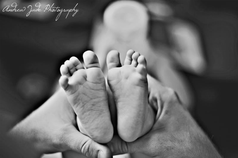
While I am still working on other logo samples, I appreciate the responses from those of you who have commented and let us know what you think. Thanks to those of you who have also gone above and given sample ideas of your own and offered help. We really appreciate it! I am still working on a couple other ones that I hope will have a good response as well and stand out as capturing our style while also being brandable. In the meantime, since I didn't just want to post this without a picture, her is a shot of Temple's feet this morning. Yes, her feet are adorable but notice something... They are HUGE (maybe it's just me and being used to easily fit them both in one hand)! :) She is growing up so fast I can't help but be amazed. Gracias for the support, everyone, and don't forget to tell your friends to check out the blog and let us know what they think.
Subscribe to:
Post Comments (Atom)


I love this one! :)
ReplyDeleteI like this logo...it seems more personally..like you have written on the picture..
ReplyDeleteBy the way when you coming up to Canada ;)
I LOVE those little feet! Sweet girl! Can't get enough of her!
ReplyDeleteI like both logos.... I LOVE the cursive. Very romantic and personal. The new one is cool though, and if I saw it on a baby picture or wedding picture I may love it....
Give my favorite niece a kiss for me!
Aubs
Everything is relative. Compare her feet to her thighs! Her feet are very, very small still! I love her so much!
ReplyDeleteRegarding the 'A' logo--i feel like its too big...but what do i know?
Grandma
Sweet :)
ReplyDelete