Tuesday, August 3, 2010
A NEW Logo
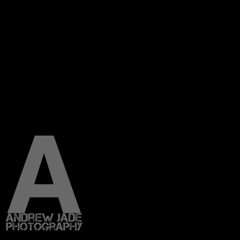
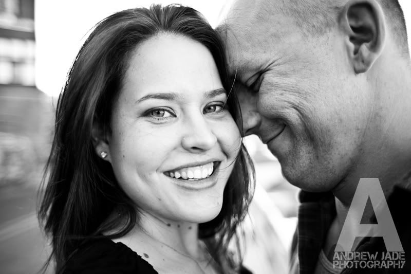
Emily and I have been talking for a while now about wanting to change up our logo. We like the one we have but we didn't put a ton of thought into it; we pretty much just found a font online that we liked and 'voila', there's our logo. We have had our current logo for about 6 months now and we have decided we want to go with something that is more of a brand than just our name in a pretty font :). Emily had a great idea that we should get our blog viewers involved to help us make the decision. We value our reader's opinions and want to know what you guys think about what kind of logo would fit best for our BLOG and our WEBSITE. I already have one that is on the final cut, but I still want to put together a couple more... who doesn't love options? :D I expect to have the logo selection within a week or so. Please link our blog to your facebook and myspace accounts and see if your friends want to get in on what logo we should pick. We will greatly appreciate what others have to say so the more comments and opinions the BETTER :). When I get the other options up, I will explain how to vote and leave a comment if you don't have a Blogger account. Thanks guys! Here is the one that I already have...
The logo isn't gray, it just looks that way. It's actually translucent so on pictures you can still see through it.
Subscribe to:
Post Comments (Atom)


Okay, since you want our opinions... I've ALWAYS REALLY LOVED the cursive fon that you guys had. It was really nice with all your wedding pictures because it had a soft and romantic feel to it, and with the pictures of family and birthday parties, it was really nice! Just my opinion. :)
ReplyDeleteJill
Really, really like it. The cursive is SOOOOO "blend in with every other wedding photograph-able".
ReplyDeleteI will remember this logo. If I saw it again later, I'd know who's logo it was instantly.
I think I agree with Jill on this one! The logo you made is awesome and edgy (what is that font by the way? I love it!) but I feel that your pictures are so soft and beautiful that maybe a softer logo would enhance the pictures more. :)
ReplyDeleteabsolutely love it!
ReplyDeletedeb mavis
You know, I thought the same thing about it being too edgy until I through it on a soft picture. It looked good! But again, there will be more choices soon my friends :) Thanks for the comments.
ReplyDeleteI love this one! It leaves an impression and I like that it will contrast with the more "soft" and emotional photos. It shows confidence - sticks out from all the "safe" logos out there :) But who am I?-- I just do the dishes. haha
ReplyDeletenot that i'm an expert on photography or logos standing out, but im just not a fan of this one :/ sorry guys! i don't mean to be a negative nancy! cant wait to see the other versions though :)
ReplyDeleteps - to better explain: i do like the font that "andrew jade photography" is in a lot....perhaps its just the very very large "A" above it thats my trouble? have you thought of using a design rather than just a letter? just a suggestion :)
ReplyDeletehmmm..I think I like the original better? I agree with it being a bit harsh... I'd like to see other options :)
ReplyDelete